Contact Us

Use the form on the right to contact us.

You can edit the text in this area, and change where the contact form on the right submits to, by entering edit mode using the modes on the bottom right. 


123 Street Avenue, City Town, 99999

(123) 555-6789

email@address.com


You can set your address, phone number, email and site description in the settings tab.
Link to read me page with more information.

Blog

Filtering by Tag: stata

How to Succeed in the EPL: Chances Created and Chance Conversion

Ford Bohrmann

A common statistic that many people have begun to value and notice a lot recently is the chances created statistic. Chances created, according to Opta's website, is defined as "assists plus Key passes" where a Key Pass is "the final pass or pass-cum-shot leading to the recipient of the ball having an attempt at goal without scoring" (Opta is a company that tracks and generates a ton of data in soccer). So basically, any pass that leads to a shot is considered a chance created.

Swansea's Mark Gower is a perfect example of a player highlighted by the chances created statistic.

Chances Created

The appeal of this measure is that it can value players that play on weaker teams better than assists do. For a player on a weaker team, it is harder to record assists since they are playing with teammates that are less likely to score. Chances created is a fairer statistic because it does not value the strength of your teammates as much. Overall, it can highlight creative players that are often overlooked because they are on weaker teams and do not have as many assists.

Do Chances Created Actually Matter?

With all this in mind, I was curious to find the actual worth of the chances created statistic. One way to measure this is to look at how chances created and wins are correlated. To make it a little easier, I looked at the relationship between goals scored and chances created for EPL teams. In other words, do teams that have more chances created score more? Do teams with less chances created score less? The answer, in short, is yes, they are correlated. Below is a scatterplot of the relationship. There is a clear positive relationship between chances created and goals in the EPL last season. The coefficient is statistically different than 0 (p=.000), which tells us that there is extremely strong evidence that there is a positive relationship.

Chance Conversion Percentages

This is only half the story though. Some teams get a lot of shots off, but either because they are not good at shooting or are taking shots that have a smaller chance of going in, some of these teams have a low number of goals because they have a poor conversion percentage for shots. The conversion percentage is defined as the goals divided by the total number of shots (excluding blocked shots). Below is a scatterplot similar to the one above, this time with conversion percentages on the x-axis. The conversion rates are rounded to 2 decimal places, hence the bunching. Again, this shows a positive relationship between conversion percentage and goals. Teams with higher conversion rates tend to score more and vice versa. This relationship is also statistically different from 0 (p=.002). A quick note: the product of chances created and conversion rate is very close to the number of goals a club has scored. I'm pretty sure the discrepancy comes from including blocked shots in shots attempted, but not in conversion rates.

EPL 2010-2011, Chances Created and Conversion %

With this in mind, I created a scatterplot of conversion rates and chances created for EPL teams last season. The plot shows that clubs found scoring success in different ways. The Manchester clubs did it by being efficient scorers; they had conversion percentages of .15 and .16. Chelsea and Tottenham were on the other end of the spectrum with higher chances created, but lower conversion percentages (.12 for both). The graphic also shows that West Ham did not struggle because they were not creating chances; they struggled because they had a low conversion percentage (.10). On the other hand, Birmingham struggled because they failed to create enough chances to score, despite a decent conversion percentage of .12.

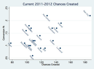
EPL 2011-2012 thus far, Chances Created and Conversion %

What about this year? Below, I created the same scatterplot as above, this time for the current season. City's dominance is really highlighted. They are leading in both chances created AND conversion percentage, hence the massive number of goals this year. Again, United seems to be scoring because of their high conversion percentage. QPR and United actually have very similar number of chances created, United just finishes their chances with a much higher percentage. Liverpool sticks out because of their high number of chances created, but really low conversion percentage (.09).

Conclusion

The bottom line is that creating chances and conversion rates are the key to understanding goal scoring. A club can succeed with a high conversion rate (United) or by creating a lot of chances (Liverpool). A club can really dominate by doing both well (City). The graphic above can also suggest what kind of players each club needs. For example, Manchester United and Newcastle would benefit by picking up a creative midfielder who creates more chances, and Liverpool and QPR would benefit by picking up a more efficient scorer. The scatterplot also tells us why some clubs struggle. Wigan needs to up their conversion percentage (currently a dismal .06) and Stoke needs to create more chances. City, on the other hand, should just continue to buy all the best players.

All data comes from eplindex.com (@EPLIndex)

Does More Possession=More Wins in the MLS?

Ford Bohrmann

In the past couple of blog posts I've looked at two common statistics and shown that they are not as meaningful as most people believe. shots on goal do not predict success very well, and assists favor players on better clubs. In keeping with this theme of misleading statistics in football, I decided to look at possession data. The commonly held notion is that the team that has the ball more (has a possession percent over 50) is more likely to win. This makes sense. A team with the ball more is more likely to score and less likely to concede. But does the data back it up? Does having more possession than your opponent mean you are more likely to win the game? I looked at the possession data from the MLS season so far. What I found goes completely against what most people would think. So far this season in the MLS, the average possession percentage for teams that have won the game is 48.5%. Teams that win actually posses the ball less. This means the average possession percentage for losing teams is 51.5%.

To get even more specific, I broke down the possession data further. Winning home teams average 50.9% possession, and winning away teams average 43.4% possession. On the other side, losing home teams average 56.6% possession and losing away teams average 49.1% possession. The histograms below illustrate these facts. I found that away teams, on average, have a possession percentage of 47.3%, and home teams have a possession percentage of 52.7%.

So what does all this mean? It seems possession percentage in the MLS does not predict success. Teams that possess the ball more don't win more; they actually lose more. Home teams also have a slight advantage in possession percentage compared with away teams.

What about teams that completely dominate possession? You might think that a team that had the ball much more often than their opponent would be much more likely to win. I defined "dominating possession" as having the ball more than 60% of the time. So far this season, teams that have dominated possession have a record of 10 wins, 19 losses, and 18 ties. Domination in possession? Yes. Domination in wins? No.

This analysis calls in to question statements like "the Union had the run of play, they possessed the ball more and deserved the win." It's apparent that in the MLS, possession is not all that important when it comes to winning games. So what's the problem with possession? One reason could be that the best teams do not play possession football. The teams with the most success may play kick and run. Another possibility is that possessing the ball simply doesn't lead to wins. Either way, having the ball more than your opponent does not mean much in the MLS.

Why We Shouldn't Put Much Value in Assists

Ford Bohrmann

Last week I wrote a post on why shots on goal are a misleading statistic. In keeping with the analysis of the problems with some commonly kept statistics in football, I decided to look at assists. 

If you think about it, assists are highly misleading. Simply playing with good players boosts your assist total. Similar to shots on goal, not all assists are the same. There are the assists where a player makes a short pass in the midfield that leads to a teammate dribbling through all the opposing defenders and finishing, and the assists where a player makes a beautiful cross where their teammate simply has to tap the ball in the open net. These obviously shouldn't be counted as the same value to the team, yet they are. Hell, I could probably record an assist eventually in the EPL if I played for one of the top teams (OK, maybe an exaggeration but you get the point.)

First, let's look at the assists data for all the teams in the EPL league. As the graph below shows, as the point value of a team increases (basically, the better the team is) the assist total also generally increases. This is no surprise. We would expect better teams to score more goals and thus have more assist totals.

Basically what this means is that the assist statistic should favor players on better teams. Players on better teams play with better teammates and should therefore have more opportunities for assists. Below is a screenshot from the EPL website of the players with the top 20 assist totals.

9 players from top 5 clubs are in the top 20 for assist totals. No players from bottom 3 clubs are in the top 20, with the exception of Blackpool's Charlie Adam who was just signed by Liverpool. It's easy to see assists totals are higher for players on better clubs.

A better statistic that is not influenced by the quality of your teammates are chances created. A chance created is defined as a pass that leads to a shot. These are obviously not as dependent on your teammates and give a more fair and true assessment of how much of a playmaker that player is for their team. 

The next time a club is looking to sign a player based solely on their assists totals, they should take a more in depth look. Assists can tell an inaccurate, or at the least biased, story.

Do Shots on Goal Matter?

Ford Bohrmann

The major point of this blog is to test commonly held notions in football for their validity. After watching the US women lose to Japan yesterday, I started to think about shots on goal. I don't have the exact numbers, but I'm pretty sure the US crushed Japan in the shots on goal category. This made me think, do shots on goal matter? Most people would quickly say yes. It would make sense that more shots on goal mean more chances to score and thus more goals. The only problem is that some things in football just don't make sense. I wanted to see if shots on goals equate to success in two categories: 1.) Do more shots on goal mean more success for a team as a whole? 2.) Do more shots on goal mean more goals for a specific player? To test these questions I used data from the MLS website. As an aside, mls.com has extensive statistics for every season in a bunch of categories. Great to see. Anyways, the data is from the 2010 MLS season.

First question: Do more shots on goal mean more success for a team as a whole?

If this was true, we would expect points to increase as shots on goal increase on a team level. In other words, teams that have more shots on goal would be more successful. The graph below tells us a different story.

The graph shows there is no real relationship between shots on goal and points. Most teams cluster around just under 140 shots on goal on the season. The line of best fit shows a positive relationship, but this relationship is not strong at all. The correlation of the graph is r=.1311. As a reminder, the correlation of a graph tells us how strong the linear relationship is between two variables. The correlation coefficient (the value of r) gives a numerical value of the strength of the relationship. A value of 0 means there is no linear relationship at all, and a value of 1 means there is a perfect positive linear relationship. In this case, the value is .1311, telling us there is a very weak linear relationship.

Second question: Do more shots on goal mean more goals for a specific player?

Similar story for this question: is there a linear increase in the amount of goals as the amount of shots on goal increases? The graph below gives us the answer.

This graph shows a stronger relationship compared with the graph above. However, the relationship is still not very strong. The value of r in this case is .4722, indicating that the relationship is stronger than the graph above. However, a correlation under .5 is generally considered to be a weak relationship. This means for individual players, shots on goals are not a very good indicator of goals.

Here's my best explanation for why shots on goal are not a very indicative statistic: Not all shots on goal are the same. There are 40 yard weak rollers that the goalie easily saves, and there are 5 yard shots that the keeper barely gets a hand on. There are weak attempts by a center back getting forward and there are breakaways by forwards. In the shots on goal statistic, in both cases the shots on goal are counted as equivalent. Obviously this makes no sense. A statistic that would be better indicative of goals scored for both questions I looked at above would be shots on goal inside the box. Shots on goal inside the box would get rid of the shots on goal that have no chance of going in. Not all shots inside the box are the same, so we have somewhat of the same problem as shots on goal. However, I assume there would be a much stronger correlation between shots on goal inside the 18 and points, and shots on goals inside the 18 and goals by an individual player. Unfortunately, I don't have the data to back up this claim (working on it). If/when I do get the data from shots inside the box I'll post the graph and the correlation between shots on goal in the box and goals.

Even without the data, the point I'm making is still clear: shots on goal do not equate to more success from a team perspective and do not correlate with goals for individual players very strongly like most people assume they do. There are better statistics than shots on goal. This means statements like "New England had 5 more shots on goal than New York, they dominated the game" and "Donovan had 4 shots on goal in the game, he was due for a goal" are not neccesarily valid. What if New England had a bunch of shots on goal from outside the 18 that never had a chance of going in? And what if Donovan's shots on goal all were weak rollers? Shots on goal are often misleading.

An Analysis of City Pre/Post Abu Dhabi Using the Transfer Price Index

Ford Bohrmann

Pretty soon I'm going to start writing the Manchester City statistical blog over at http://www.eplindex.com/ (@EPLIndex). I also just read Pay As You Play by Paul Tomkins. If you haven't read it and you're interested in statistics and football, you should really give it a read. The book basically outlines the trend in the EPL that money buys points using what Tomkins calls the Transfer Price Index. More specifically, the higher the cost of the XI (Tomkins refers to this as £XI) the more a team tends to win. Of course, there are exceptions to this, but in general it seems to hold true. Anyways, when I was reading the book I thought it would be a good idea to analyze City using Tomkin's data, especially when I saw that my future fellow City blogger at EPL Index Danny Pugsley (@danny_pugsley) wrote the "Expert View" for the City section. I'm no expert on the analysis that Tomkins does, but I understand a good amount from reading the book. The subject of the book rings especially true for City considering the recent Abu Dhabi takeover and sudden influx of large amounts of cash for the club.

Some notes before the analysis: One, the data I am using is all from the book Pay As You Play, as I mentioned above. Two, make sure to notice some data is missing for years when City was not in the top flight. Three, the data in the book only goes to the 2009/2010 season, so the 2010/2011 season is missing.

Basically, I looked at 3 questions: 1.) Does City really spend more money since the Abu Dhabi take over? 2.) Does a higher £XI cost equate to success for City in the EPL? 3.) Screw 1 and 2. What if City keeps buying Robinho's?

Does City really spend more money since the Abu Dhabi take over?

Yeah, really dumb question. Pretty obvious the answer is yes. Below is the graph comparing the league average starting eleven cost and the City starting eleven cost since 1992. In the 2008/2009 City's £XI is higher than the league average for the first time since the 1994/1995 season. Remember, Abu Dhabi took over at the start of the 2008/2009 season. For the 2009/2010 season it skyrockets to over £120,000,000. City now has money to spend.

Does a higher £XI equate to success for City in the EPL?

The answer Tomkins gives for EPL clubs in his book is yes. Again, this makes sense. Clubs that are able to spend more on players should be able to produce higher quality sides and win more. I wanted to analyze specifically City's success, so I looked at the data to see if their £XI rank in the EPL follows their league position. In other words, does City succeed more when they spend more? Looking at the graph below, the answer seems to be yes. The league postion (green line) generally follows the club's £XI rank (orange line).

Screw 1 and 2. What if City keeps buying Robinho's?

The first two graphs seem to point to inevitable success for City. They have a lot of money and money can buy success, so they'll succeed, right? People will obviously point to some recent not-so-successful expensive purchases. Robinho, Jo, and Santa Cruz are the 3 big ones. Each has had start percentages of 47, 16, and 16 respectively, despite a massive total cost of £69,000,000. A good graphic to show the efficiency of purchases is the cost per point used in

Pay As You Play

. Clubs that are efficient in this regard will have spent less money per point earned, while clubs that are inefficient will do the opposite. The graph shows how much City spent in each year for each point they earned. Not surprisingly, the cost per point has spiked since 2008. This may seem like money is being wasted. While City may not be getting as much bang for their buck, it likely won't matter in terms of success. According to Tomkins, the highest cost per point goes to Chelsea in 2006/2007. They finished in 2nd that year. It seems that simply having a lot of money can trump inefficiencies displayed from the cost per point value. Tomkins even refers to City's high cost per point on page 18: "Manchester City will certainly close the gap for this unwanted honour (although if they win the league, they won't care what people think; they could probably afford to pay £4m or £5m per point if it would guarantee them success)." So yes, City may make some poor purchases like Robinho, Jo, and Santa Cruz in the future. All in all, it doesn't matter that much though. City has so much money that they'll win anyways.

Fun With Graphs

Ford Bohrmann

Often graphs can tell us a lot more about certain data then just the numbers itself. At least they are usually easier to understand. I just downloaded Aaron Nielsen's (@ENBSports) amazing database from the 2010 MLS season and started playing around with it. Here are some interesting graphs I came up with:

This is probably a graph that already exists somewhere, but I made it anyways. It really highlights how much Seattle dominates attendance in the MLS. Also added in a bar for average attendance (between Chicago and Salt Lake) for comparison.

Another graph that highlights domination (in this case probably in a negative sense) of one team over all the others. All teams fall in the range of 1.4 to 1.8 cards per game. However, its clear that Toronto is an outlier with 2.17 cards per game.

This graph once again shows domination by one team in a certain statistic. Dallas scored almost 20% of their goals from PK's.

That's 1 out of every 5 goals

. This almost doubled every other team in the MLS last season, and was 10 times the percentage of Seattle. Hmm. Not exactly sure what the explanation here is. Is Dallas really good at diving? Are they being favored by refs? Are they just getting a lot of chances in the box? Something to look at in the future.

For the percentage of goals scored outside the 18, I took the 2 lowest, 2 highest, and the average. Dallas (likely from their massive share of goals from PK's) and Columbus have the lowest percentage of goals scored from outside the 18. New England and Chivas USA have the two highest percentage of goals scored from outside the 18. This shows not every team is scoring goals the same way in the MLS. Having a high percentage of goals from outside the 18 doesn't exactly mean the team is being creative or is better at long distance shooting. Instead, it more likely tells us that the team struggled in scoring goals within the 18, where the bulk of goals are scored. Dallas and Columbus were 4th and 5th last year, respectively, while New England and Chivas USA were 13th and 15th, respectively.

Another Look at Referee Bias: Extra Time Given

Ford Bohrmann

Yesterday I looked at referee bias in this past season for the EPL. It turned out that while referees favored the home team overall in parts of the game like fouls, yellow cards, and red cards, it is more likely due to the advantage the home team has in a game. One statistic I did not look at though, is the amount of extra time given.

Extra time has nothing to do the relative abilities or score of the game like many other parts of soccer do. In theory, it should be an objective amount not dependent on if the home or away team is leading in the game. You see in almost every game though, the home crowd jeering for the ref to end the game if their team is ahead, or cheering even louder for their team to come back if they are trailing. Based on this, referee bias would be present if home teams that are leading have shorter games compared with away teams that are leading. The obvious logic being that the referee gives in to the home team's fans and adjusts his extra time given unconsciously.

To do this I looked at the length of the game for home teams that won the game versus length of the game for away teams leading. If there is indeed a referee bias then we should see that the length of games is shorter for home leading teams versus away teams.

Below are histograms (graphs showing the frequency of each dependent variable value) of the length of the game for the two categories above.

We can see the graphs are very similar, except for the tail on the right end of the away win time. This is in accordance with our hypothesis that away teams that are leading face more extra time. It seems refs gave trailing home teams more than 10 minutes of stoppage time more than they gave trailing away teams more than 10 minutes.

Like the previous post looking at referee bias, I did statistical analysis to see if the difference was actually statistically significant (in other words, the difference was not due to randomness). The mean length of game for leading home teams was 96.36 minutes, while the mean length of games for leading away teams was 96.56.

Using the data, I ran a two sample t-test. Basically what a

 t-test does is takes in to account the number of observations, mean, and standard deviation (measure of spread) and tests to see if they are equal. In the end, the test gives a p-value between 0 and 1. A p-value basically answers the question, if the two means were actually the same (time given for leading teams were the same for home and away), what is the probability that we there would be a difference in the means that we actually saw. In this case, a probability of 0 suggest that the means are different, and one of 1 suggests they are the same. Generally, a p-value of .05 or lower is statistically significant, meaning we can rightfully say the means are not the same.

After doing the test, the p-value I got was 0.2013. While this suggests that referees are giving more time to trailing home teams, it is not at a statistically significant level. In other words,

we cannot conclude that referees give more extra time to trailing home teams compared with trailing away teams.

 It may seem like there is a bias evident based on the means, but it is not at a statistically significant level.

All in all, referees are doing a good job in terms of not favoring home teams over away teams. Next time someone complains that the ref is favoring the home team, you can just tell them to look at the data.